Federal
Emergency
Management
Agency
Web Redesign

Overview
THE CLIENT: FEMA is a government agency designed to lead America in preparation, prevention, and quick response to both natural and man-made disasters. You can learn more at FEMA.gov
MY ROLE: UI Design, User Research, & Presentation.
TOOLS: Adobe XD, InVision, Miro, Google Suite, Optimal Workshop, Trello, Slack.
DURATION: 3 Weeks
THE TASK: For this design challenge, I was given the task of choosing a government agency to conduct user research for, with a goal of providing a more efficient, responsive website for its users. This design challenge was a quick one: 3 weeks. After browsing several government agencies' current website, I came across FEMA's.
Due to my passion for helping and healing others, I immediately knew that I wanted to jump right in, and give FEMA's website a user centered redesign. Right away, I noticed that the current website had a lot of information for its intended users. The problem, however, is that there was no easy system for delivery. All possible pages and sub pages on the site were right in the menu navigation...all 50+ of them.
OUR SOLUTION: Create a simple, clean, and responsive web redesign that focuses on getting potential disaster victims to the information they need, and fast! The redesign focuses on addressing the very content heavy navigation, and organization of the wealth of information.
Skip to THE DESKTOP PROTOTYPE or THE MOBILE PROTOTYPE
The Research
Finding the Pain
Proto-Persona
Usability Tests
User Interview
Online Surveys
Heuristic Evaluation
Navigation Evaluation
Who are
FEMA's users?
I began with a proto-persona, based on who I believed could be a potential user of the FEMA site...naturally, this persona is a middle aged adult, who has just experienced a disaster, and is seeking help.

Goals:
Emergency Shelter
Basic Human Needs
Resources for future
Pains:
No renters insurance
Doesn't know where to find help
Lost everything to disaster
"The tornado ruined my home and belongings...I have 3 kids, and have nowhere to turn. What do I do?"
MARIAH THE MOM
AGE: 35
From here, I conducted several usability tests on the current webpage. This would give me a better idea on how real users were navigating the current site, and where the biggest pain points may lie.
Although testing was painful to watch...I gained some incredible insight as to where the biggest issues are currently with this site. My initial thoughts were correct...the navigation was overwhelming, and causing users to give up!
“I feel like they made this website difficult on purpose, so that they can avoid giving people assistance in disaster scenarios…”
Brayana, 26
“I don’t understand where I am supposed to click. Why are there so many links?”
Jessie, 43
One on One interviews and online surveys revealed that people want to be able to quickly locate key information on dogs that are available for fostering and adopting. We found that a large majority of our users were finding the fostering and adoption process more painful than they had expected it to be. We discovered that a lot of potential foster families were jumping straight to adoption due to a lack of clear information on fostering. We chose to focus on potential foster families to further empathize with.
See more user insights HERE
The Research
Finding the Pain
Proto-Persona
Usability Tests
User Interview
Online Surveys
Heuristic Evaluation
Navigation Evaluation
Who are
FEMA's users?
I began with a proto-persona, based on who I believed could be a potential user of the FEMA site...naturally, this persona is a middle aged adult, who has just experienced a disaster, and is seeking help.
Goals:
Emergency Shelter
Basic Human Needs
Resources for future
Pains:
No renters insurance
Doesn't know where to find help
Lost everything to disaster
"The tornado ruined my home and belongings...I have 3 kids, and have nowhere to turn. What do I do?"
MARIAH THE MOM
AGE: 35
Site Testing and Redlining
I conducted several usability tests on the current webpage. This would give me a better idea on how real users were navigating the current site, and where the biggest pain points may lie. Users were asked to navigate to the Individual Disaster Relief Page.
See the User Path Flow
Although testing was painful to watch...I gained some incredible insight as to where the biggest issues are currently with this site. My initial thoughts were correct...the navigation was overwhelming, and causing users to give up!
“I feel like they made this website difficult on purpose, so that they can avoid giving people assistance in disaster scenarios…”
Brayana, 26
“I don’t understand where I am supposed to click. Why are there so many links?”
Jessie, 43
“I like the simplicity of the colors and text...but there is a wealth of information to go through. I have to just search instead.”
Tamara, 48
A heuristic evaluation provided an even more clear picture as to where to focus during the redesign. The current site was doing fine with its aesthetics, there was definitely a LOT of content for users to find, and the site even featured a variety of beautiful photographs and a pleasing color scheme.
However, the copy heavy navigation with seemingly unlimited amounts of links, lack of organization of information, and overall functionality and efficiency of the site were confusing users, and ultimately, causing them to give up on finding the disaster assistance they desperately needed.
See the full Heuristic Evaluation HERE
Redesigning the site will likely allow people to easily find the information they need. This is vital for people who are in immediate need of assistance. My goal was to streamline the process of finding individual disaster assistance (one of FEMA's most needed services), while updating the navigation for the site, as a whole.
Definition & Ideation
How might we improve the user's experience?
As I began to design a new web experience for our users, I prioritized key features that needed to be included. I prioritized these features based on both how much impact and how much effort they would take.
Next, I gathered further insight from our users on how best to display these key features, by conducting a card sorting survey. This survey allowed me to better understand how our users chose to navigate through separate tasks:
See the Card Sorting
New FEMA Site Map

The data from my card sorting survey consolidated the site's navigation into 6 key pages. These pages, FEMA's top priorities, include sub pages for users to be able to quickly narrow down their search. The main pages include:
-About
-Disaster Assistance
-Emergency Preparedness
-Resources
-Emergency Communications
-Contact
User Interface Design
Style Tile

At the heart of my redesign, I kept the organization's most important aspects: nature and relief.
Because I didn't receive negative feedback regarding the color or aesthetic of the original site, I also kept the current logo, site colors, and general look in mind. I wanted to make sure to keep it professional, using blues, neutral earth tones, and simple/easy to read fonts. I also kept buttons rounded, to ensure there were no harsh lines, and that it matched the logo's round look.
Wireframes
Low Fidelity Mock-ups


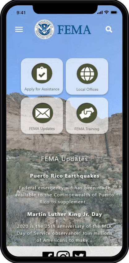
While keeping the 6 key features prioritized in the top navigation, I designed the homepage to also include quick links to top FEMA services.
I also included a section for important news updates, as this is also a key feature for FEMA users. This allows users to see FEMA announcements immediately upon reaching the site.
I added drop down menus for each sub page, that are accessible from any page on the site. I kept these alphabetized, so that users could easily find their needed sub page.
From here, I began to take elements from the desktop wireframes, and the style tile, and create higher fidelity screens for prototyping. Both a mobile site, and a desktop site, were created during this stage.

Prototyping
High Fidelity Mock-Ups
For simplicity and ease for FEMA's users, I kept the final prototypes very similar in style. I created icons, buttons, and easy to use navigation menus for both the mobile and desktop versions of the new site.
Results & Reflections
Where can we improve?
Reflecting on what's next...
Final testing showed huge cut downs on time to target tasks during a final round of usability testing. This included having users attempt to locate and "apply" for individual disaster assistance, "sign up" for emergency updates, and find contact information for FEMA. 100% of the users who participated in the final round of usability tests were able to complete these tasks on the mobile and desktop versions of the site, and much more quickly than before!
One of the biggest struggles with this design challenge was the lack of access I had to real stakeholders. Because it is a large, government run organization, and the timeline on this project was only a few weeks, I wasn't able to gain access to any of FEMA's personnel. With more time, I would like to have included interviews from FEMA officials, and their past/current users.
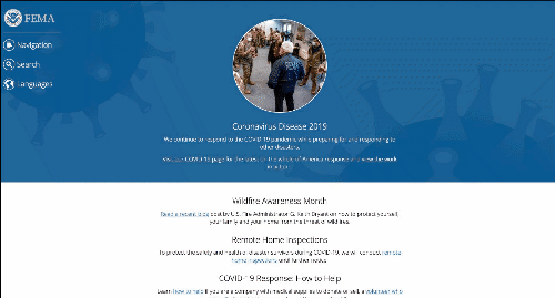
My next step in this process is to continue collecting data and iterating on the prototype designs. Some of the feedback I received during usability testing revealed that some users felt the background images on the homepage made the news updates section difficult to read. Planning ahead for the next iteration, I plan to do more research into how to create more user friendly designs that account for accessibility needs, and how color theory can impact how at ease users feel when using this site.
Curious about FEMA’s newest update to their site? Click here to see if any of this project’s ideas coincide with what FEMA ultimately did end up doing when redesigning their webpage. FEMA site 2024: https://www.fema.gov/